Dashboard
Your daily starting point: KPIs, charts and the latest activity — at a glance.
Main dashboard
Route: /dashboard
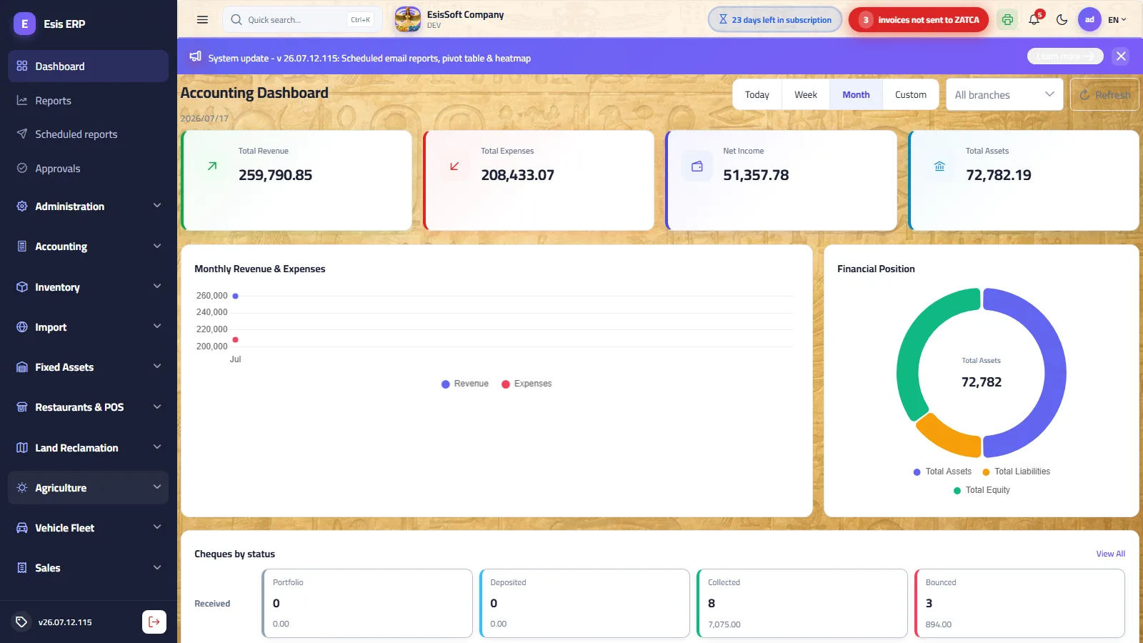
The main dashboard is the accounting analytics dashboard. It opens right after signing in and summarises the financial state of the company for the current open fiscal year. The header shows the dashboard title with today's date beneath it; all figures respect the filter bar (period + branches) described below.
| Element | What it shows |
|---|---|
| Filter bar | Period presets (Today / Week / Month / Custom), a branch multi-select and a Refresh button. Every change reloads all widgets immediately. |
| Four KPI cards | Total Revenue, Total Expenses, Net Income and Total Assets — each with a month-over-month change badge and a mini trend line (sparkline). |
| Monthly Revenue & Expenses | An area chart of revenue vs expenses per month across the fiscal year. |
| Financial Position | A donut of Assets / Liabilities / Equity with Total Assets in the centre. |
| Cheques by status | Received and issued cheques grouped by lifecycle status — count and total amount per status. |
| Recent Entries | The six most recent journal entries with their posting status. |
| Most Active Accounts | The six accounts with the largest total movement (debit + credit). |
The filter bar
| Control | Behaviour |
|---|---|
| Today | Only today's transactions. |
| Week | The last 7 days, including today. |
| Month | From the 1st of the current month up to today. This is the default when the dashboard opens, so the landing view always carries data. |
| Custom | Reveals two date pickers (From date / To date). Both bounds are inclusive; clearing one leaves that side open. |
| Branches | Multi-select of the active branches. Leaving it empty means All branches. Selecting or deselecting a branch reloads the figures at once. |
| Refresh | Re-queries everything with the current filters — use it after posting documents in another tab. |
The four KPI cards
| Card | What the number includes |
|---|---|
| Total Revenue (green) | The total of revenue accounts for the fiscal year, restricted to the selected period and branches. |
| Total Expenses (red) | The total of expense accounts for the same filters. |
| Net Income (indigo) | Revenue minus expenses — the profit for the filtered scope. |
| Total Assets (blue) | The balance-sheet asset total. This card carries no change badge and no sparkline, because it is a position (snapshot), not a flow. |
The change badge: under each of the first three cards you see an arrow with a percentage and the caption “vs previous month”. It compares the latest month of the fiscal year's monthly series with the month before it. Colour encodes meaning, not direction: revenue or net income going up is green (good); expenses going up is red (bad), and expenses going down is green. The badge is hidden when there is no comparable data — fewer than two months in the year, or a zero previous month.
The sparkline: the small line at the bottom of each card draws the month-by-month values of the same figure across the fiscal year, so you can spot the trend without opening a report.
The charts
| Chart | How to read it |
|---|---|
| Monthly Revenue & Expenses | A smooth area chart with one point per month: the indigo series is Revenue, the red one Expenses. Hover anywhere to see both values for that month in one tooltip; click a legend circle to temporarily hide a series. |
| Financial Position | A donut splitting Total Assets, Total Liabilities and Total Equity (absolute values). The centre displays the Total Assets figure. Balanced books mean assets ≈ liabilities + equity. |
| Most Active Accounts | Horizontal bars of the six accounts with the largest total movement (debit + credit) in the filtered trial balance. A long bar means the account is heavily used — a quick way to see where the activity of the period concentrated. |
Cheques by status
This panel groups the company's cheques into two rows — Received and Issued — and shows one pill per lifecycle status with the count of cheques and their total amount:
| Group | Statuses |
|---|---|
| Received cheques | Portfolio (in hand, not yet banked) → Deposited (sent to the bank) → Collected (money received) — or Bounced (returned unpaid). |
| Issued cheques | Issued (handed to the beneficiary) → Cleared (debited from your bank) — or Cancelled. |
Recent Entries
The last six journal entries with document number, date, description, total debit and a coloured status tag: Posted (green), Unposted (amber), Reversed (red). View All jumps to the Journal Entries screen. Note this list shows the latest entries regardless of the period filter — it is a “what happened last” feed.
A worked reading example
Troubleshooting
| Symptom | Likely cause and fix |
|---|---|
| Everything shows zeros | No open fiscal year covers today, or no journal entries are posted yet. Define/open the fiscal year in Accounting, and remember most figures come from posted documents. |
| “Today” looks empty | Normal early in the day — nothing has been posted yet. Switch to Month (the default) for a meaningful view. |
| Numbers look too small | Check the branch filter — you may be looking at one branch only — and the date range under Custom. Empty branch selection = all branches. |
| Cheques panel is empty | Either no cheques are recorded or your role lacks the cheques view permission. Ask your administrator. |
| Figures seem stale | Data loads when the page loads or a filter changes. Click Refresh after posting documents in another tab. |
FAQ
Q: Does the change badge follow the period I selected?
A: No — it always compares the latest month of the fiscal year with the month before it, independently of the Today/Week/Month buttons. The cards' values, however, do follow your filters.
Q: Why doesn't Total Assets show a badge or sparkline?
A: Assets are a snapshot of a position, not a monthly flow, so a month-over-month percentage would be misleading.
Q: Can I compare two branches side by side?
A: Not on one screen — select one branch, note the figures, then switch. For a proper comparison use the reports module.
Q: Do draft (unposted) documents affect the KPI cards?
A: No. Financial figures build from posted journal entries; drafts only appear in the Recent Entries feed with an amber tag.
Module dashboards
Route: /dashboard/<module> — opened by clicking the module name in the sidebar
Clicking a module header in the sidebar (rather than one of its screens) opens a dashboard tailored to that module. All module dashboards share one layout: four KPI cards, one bar chart, one donut chart with the total in its centre, and a latest documents table with a View All link into the module's list screen. The Accounting header opens the full main dashboard described above.
Shared filter bar — flows vs snapshots
The same period presets appear here (Today / Week / Month / Custom with two date pickers) plus a Refresh button. There is no branch filter on module dashboards. One rule to remember:
| Kind of figure | Affected by the period? | Examples |
|---|---|---|
| Flows (documents with a date) | Yes — only documents whose date falls inside the range count. | Period sales, period costs, latest invoices/shipments/trips tables. |
| Snapshots (current state) | No — they always show “now”. | Stock value, active customers/suppliers/items, active vehicles, users. |
| Trend charts | No — the 6-month bar chart always covers the last 6 calendar months. | “Monthly totals (last 6 months)” in Sales and Purchasing. |
Sales dashboard /dashboard/sales
| Widget | Content |
|---|---|
| KPI: Period total | Sum of posted sales invoices dated inside the period. |
| KPI: Outstanding amounts | For those posted invoices: total minus what was paid — what customers still owe from this period. |
| KPI: Unposted documents | Count of draft (not yet posted) invoices in the period. |
| KPI: Active customers | Snapshot count of active customer cards. |
| Bar: Monthly totals (last 6 months) | Posted sales per calendar month, oldest first — your revenue trend. |
| Donut: Collected vs remaining | Splits the period's posted total into Collected and Remaining; the centre shows the total. |
| Sales heatmap (last 12 weeks) | A calendar grid — 12 weeks × 7 days — where the darker the cell, the higher that day's posted sales. Hover a cell for its date and amount. Instantly reveals your strong weekdays and dead days. |
| Latest sales invoices | The six most recent invoices in the period: number, date, customer, total, status. |
Purchasing dashboard /dashboard/purchasing
The exact mirror of the Sales dashboard for purchase invoices: Period total (posted purchases), Outstanding amounts (what you still owe suppliers on the period's invoices), Unposted documents and Active suppliers; a 6-month bar chart; a Paid vs remaining donut; and the latest purchase invoices. There is no heatmap here.
Inventory dashboard /dashboard/inventory
| Widget | Content |
|---|---|
| KPI: Active items | Count of active item cards (snapshot). |
| KPI: Stock value | The current value of on-hand stock across all warehouses (snapshot — the period filter does not change it). |
| KPI: Below reorder level | Count of item/warehouse stock lines currently under their reorder point — your restocking to-do list. |
| KPI: Warehouses | Count of active warehouses. |
| Bar: Top items by stock value | The six items tying up the most stock value. |
| Donut: Stock by warehouse | How the total stock value is distributed across warehouses. |
| Latest stock adjustments | Adjustment documents dated inside the period, with warehouse and status. |
Imports dashboard /dashboard/imports
| Widget | Content |
|---|---|
| KPI: Open shipments | All shipment files not yet at the Closed stage. |
| KPI: In transit | Shipments currently at the In Transit stage. |
| KPI: Open goods value | Goods total of the open shipments — capital on the water. |
| KPI: Open landed costs | Freight, customs and other landed costs accumulated on the open shipments. |
| Bar: Costliest open shipments | The six open shipments with the highest goods + costs total. |
| Donut: Shipments by stage | Counts per stage: Open → In Transit → Arrived → Cleared → Closed. |
| Latest shipments | Shipments dated inside the period with supplier and stage. |
Fixed assets dashboard /dashboard/assets
| Widget | Content |
|---|---|
| KPI: Active assets | Count of assets in Active status. |
| KPI: Total cost | Sum of acquisition costs of the active assets. |
| KPI: Accumulated depreciation | Depreciation accumulated to date on those assets. |
| KPI: Book value | Cost minus accumulated depreciation — the current net worth of the fleet of assets. |
| Bar: Top assets by book value | Your six most valuable assets today. |
| Donut: Cost by category | Acquisition cost split by asset category. |
| Depreciation runs | Monthly depreciation runs (year, month, run date, asset count, amount) dated inside the period. |
Fleet dashboard /dashboard/fleet
| Widget | Content |
|---|---|
| KPI: Period freight | Revenue of trips whose start date falls in the period. |
| KPI: Period expenses | Trip expenses plus standalone vehicle expenses dated in the period. |
| KPI: Trips net | Net result (freight − expenses) of the period's trips. |
| KPI: Active vehicles | Snapshot count of vehicles both active and in Active status. |
| Bar: Net per trip | Net amount of each recent trip — spot the loss-making trip at a glance. |
| Donut: Expenses by type | Period expenses split by type (fuel, maintenance, …). |
| Trips | The latest trips with vehicle, freight, expenses, net and status. |
Agriculture dashboard /dashboard/agri
| Widget | Content |
|---|---|
| KPI: Open seasons | Count of seasons still in Open status. |
| KPI: Period costs | Season costs dated inside the period. |
| KPI: Period harvest | Value of harvests recorded inside the period. |
| KPI: Seasons profit | Accumulated profit across all seasons (not period-filtered). |
| Bar: Profit per season | The six most profitable seasons (number + crop). |
| Donut: Costs by type | Period costs split by cost type (seeds, fertiliser, labour, …). |
| Harvests | The period's harvest documents with season, quantity and value. |
Land projects dashboard /dashboard/land
| Widget | Content |
|---|---|
| KPI: Open projects | Projects in Open status. |
| KPI: Budgets total | Sum of the open projects' budgets. |
| KPI: Accumulated costs | Total costs recorded on all projects. |
| KPI: Budgets remaining | What is left of the open projects' budgets — an early overrun warning. |
| Bar: Costs per project | The six projects with the highest accumulated costs. |
| Donut: Costs by type | Period costs split by cost type. |
| Project costs | Cost documents dated inside the period with project, type and amount. |
Restaurant dashboard /dashboard/rest
| Widget | Content |
|---|---|
| Orders received hero | A large banner: total orders received in the period, split into Accepted (every order not cancelled) and Rejected (cancelled), each with its percentage and a green/red proportion bar. |
| KPI: Period sales | Revenue of paid orders in the period. |
| KPI: Paid orders | Count of paid orders. |
| KPI: Open orders | Orders still open (unpaid) — watch this before closing the shift. |
| KPI: Average ticket | Period sales divided by the number of paid orders. |
| Bar: Daily sales | Paid revenue per day inside the period. |
| Donut: Orders by state | Open (amber), Paid (green), Cancelled (red). |
| Orders | The latest orders with type, total and state. |
Administration dashboard /dashboard/admin
| Widget | Content |
|---|---|
| KPI: Users | Total user accounts. |
| KPI: Active users | Users who are active and not locked out. |
| KPI: Locked accounts | Accounts locked (e.g. after repeated failed logins) — review these regularly. |
| KPI: Roles | Count of defined roles. |
| Donut: Users by role | How many users hold each role (a user with several roles counts in each). |
| Latest users | Recently created users with e-mail and roles. No bar chart and no period bar here. |
A worked reading example
Troubleshooting
| Symptom | Likely cause and fix |
|---|---|
| The whole dashboard is empty / zeros | Your role may lack view permissions for this module's data, or the module simply has no documents yet. Widgets whose data you cannot access stay silently empty. |
| KPIs show data but the “latest” table is empty | The table is period-filtered — no documents dated inside the selected range. Widen the period or pick Custom. |
| Stock value does not change with the period | By design: stock value, customers, vehicles, users are snapshots of “now”, not period flows. |
| An invoice I just saved is missing from the period total | Only posted documents count in money KPIs; drafts appear in the Unposted documents counter instead. |
| The 6-month chart ignores my custom dates | By design: the trend chart always shows the last six calendar months. |
FAQ
Q: How do I open a module dashboard?
A: Click the module's name (the header row) in the sidebar. Clicking a screen beneath it opens that screen directly.
Q: Why is there no branch filter here, unlike the main dashboard?
A: The commercial and operational documents on these dashboards do not carry a branch dimension yet, so a branch filter would have nothing to act on.
Q: The counts differ from what the list screen shows — why?
A: Check three things: the period filter (lists usually show everything), posted vs draft status, and — for stock — that the dashboard sums all warehouses.
Q: Does the dashboard update by itself while it is open?
A: No. It loads when opened and when a filter changes; click Refresh to re-query at any time.
Frequently asked questions
What does the KEMTOVA ERP dashboard show?
It presents KPI cards (revenue, expenses, net income, assets) with month-over-month deltas, a revenue-vs-expense trend chart, a financial-position donut, top accounts and the latest journal entries.
How do I change the dashboard period?
Use the period presets (Today / Week / Month) or pick a custom date range; you can also filter by branch to focus the figures.
Why does the dashboard show zeros?
It reads the active, open fiscal year. If no fiscal year covers today or the period has no posted entries, the figures show zero — check your fiscal year and post entries.
Is there a dashboard per module?
Yes. Each sidebar module opens its own dashboard (sales, inventory, contracting, etc.), while the main dashboard focuses on accounting analytics.